Author: Bradley Martinez
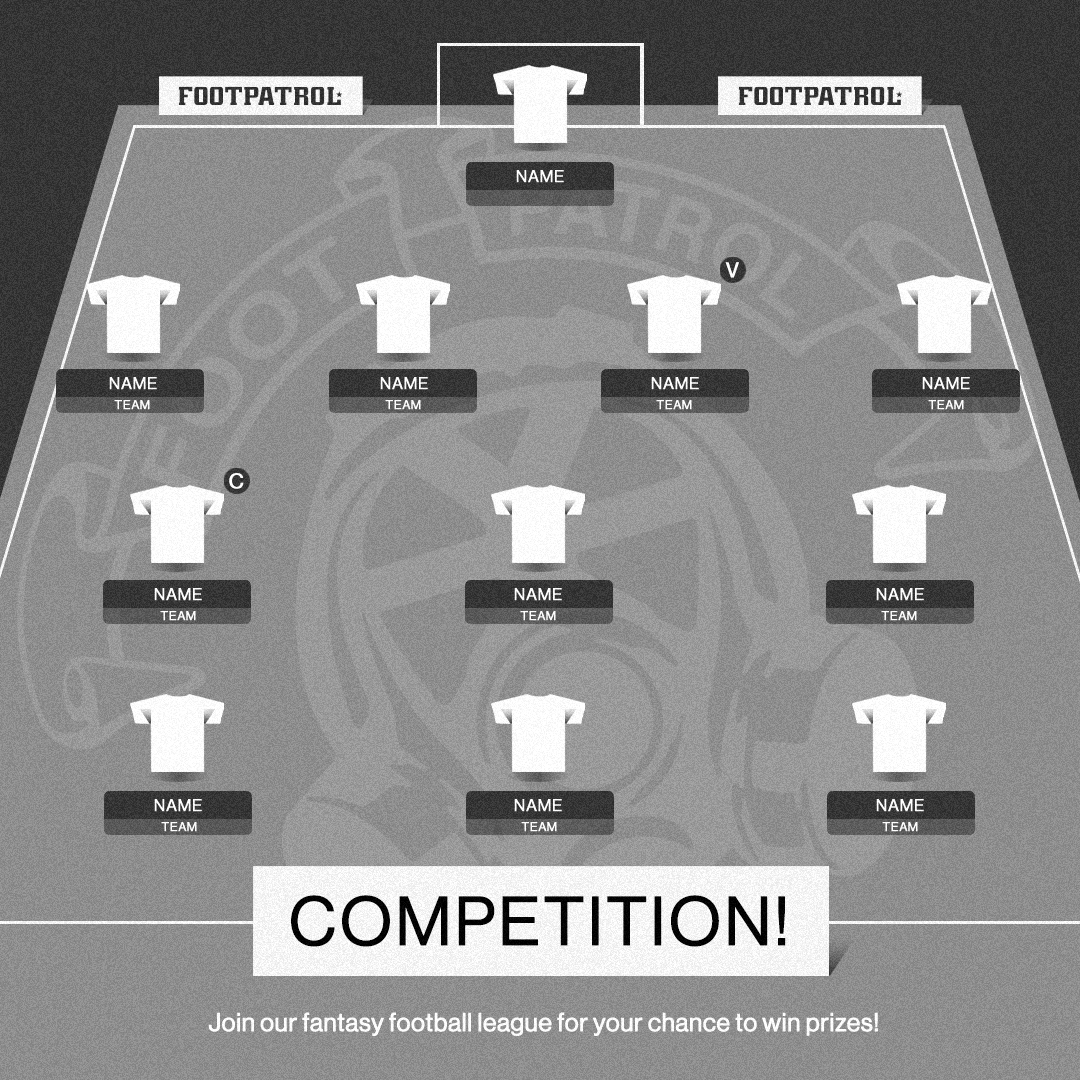
Finally, the football season is back! To celebrate, we’ll be hosting a Footpatrol fantasy football league over on the PL app where you can pit yourself against members of #TEAMFP. Let’s not forget the chance of winning some great prizes!
The top 3 winners will each walk away with a prize. 1st place, a £500 gift card, 2nd place, a £250 gift card and 3rd place, a Footpatrol care package worth up to £200… To enter all you must do is the below.
Follow @Footpatrol
Like the post on our Instagram feed.
Comment your team name within the app on the post.
Enter the ‘FP Community League’ on the PL app using the code ‘j6kh79’.
Good luck and we’ll share updates throughout the season!
T&Cs apply*

Footpatrol Fantasy Premier League Competition Terms and Conditions
By taking part in this promotion you accept and agree to these terms and conditions. If you do not agree with any of these terms and conditions then you should not take part in the promotion. It is your responsibility to ensure that you review the terms and conditions before entering the promotion. We, JD Sports Fashion plc t/a Footpatrol (“Footpatrol”), recommend that you print and store or save a copy of these terms and conditions for future reference during the promotion. Footpatrol is the promoter of this promotion.
This promotion is not affiliated with or endorsed by the Fantasy Premier League (the “FPL”) or Instagram.
- What can you win?
There will be three (3) winners:
The entrant with the highest points total in the Footpatrol FPL league will win a Footpatrol gift card with a value of £500 (gift card T&Cs apply: https://www.footpatrol.com/customer-service/gift-card/) (the “First Place Prize”). For the avoidance of doubt, the winner will be entitled to determine if the gift card shall be an e-gift card or a physical card to be sent to their address.
The entrant with the second highest points total will wina Footpatrol gift card with a value of £250 (gift card T&Cs apply: https://www.footpatrol.com/customer-service/gift-card/) (the “Second Place Prize”). For the avoidance of doubt, the winner will be entitled to determine if the gift card shall be an e-gift card or a physical card to be sent to their address.
The entrant with the third highest points total will win a Footpatrol care package containing product selected by Footpatrol up to the value of £200 (the “Third Place Prize”).
(Together, the “Prizes”).
The Third Place Prize is subject to availability (including availability of sizes, styles and colours). Footpatrol cannot guarantee that a particular shoe will be available in the winner’s size. The Prizes are subject to winner confirmation (i.e. Footpatrol has been able to contact winners and has been able to confirm eligibility). Footpatrol has the right to change, alter or withdraw the promotion or the Prizes at any time due to any change in any applicable law or any events outside the control of Footpatrol. Footpatrol shall not be responsible for any delay, cancellation or rescheduling of the Prizes. If any part of the Prizes are not claimed (for whatever reason), Footpatrol is under no obligation to supply an alternative prize.
The Prizes are not available for sale, transfer, resale, donation, or exchange. Exchanging any part of the Prizes is strictly prohibited (including, without limitation, in person or online via an online auction website or online resale marketplace). Footpatrol reserves the right to cancel the promotion and withdraw or make void any and all prize elements if this term is not complied with.
What is excluded from the Prize?
It is the winners’ responsibility to organise and pay for anything excluded from the Prize, including potential internet service fees that may arise through use of the FPL website. Footpatrol shall pay for delivery of the Prizes to the relevant winners.
Who can enter?
Entrants must be aged 16 years or over, have Instagram and internet access and be able to verify their identity through a valid and official ID.
Footpatrol reserves the right to ask the winners to provide proof of age. Employees (and their immediate family) of the JD Sports group (http://www.jdplc.com/our-group/sports-fashion.aspx), or anyone else professionally connected with this promotion are not eligible to enter the promotion. Footpatrol reserves the right (at its sole discretion) to decide if the eligibility criteria are met. If the eligibility criteria are not met, the entry will be invalid.
How to enter
Entrants can enter the promotion by following all of the steps below:
create an account or log in to their personal FPL account (FPL can be accessed here: https://fantasy.premierleague.com/);
follow the steps to register;
join the Footpatrol FPL league by using the code, ‘j6kh79’ on the FPL website or mobile app before 19 May 2024 or before the date the league closes if earlier;
follow @footpatrol on Instagram (and must be following @footpatrol on Instagram on 19 May 2024);
like the post announcing details of the Footpatrol Fantasy Premier League (the “Announcement Post”); and comment on the Announcement Post with the team name that they have chosen on FPL.
Internet service providers’ fees may apply when accessing the internet. No purchase is necessary to enter the promotion.
Users must adhere to the FPL T&Cs (https://fantasy.premierleague.com/help/terms). Any non-compliance with the FPL T&Cs will render an entrance void.
Participation is limited to one entry per person only. If more than one such entry is received, only the first entry will be accepted. No responsibility is taken for entries that are lost, delayed, misdirected or incomplete or cannot be delivered or entered for any technical or other reason.
Closing Times
The promotion will commence on 11 August 2023 at 14:00 (UK time) (the “Start Time”) and will end on the later of 19 May 2024 at 18:00 (UK time) or the conclusion of the final Premier League match of the 2023/24 season (the “Closing Time”). Any entries received after this date and time will not be valid.
How are winners selected?
The entrant with the highest points total in the Footpatrol FPL league at the Closing Time will win the First Place Prize, whilst those with the second and third highest points totals at the Closing Time will win the Second Place Prize and the Third Place Prize, respectively. The decision of Footpatrol is final and binding on all entrants. No correspondence will be entered into regarding the selection of the winners (other than with the winners themselves). The winners will be notified via Instagram DM on 22 May 2024 and are required to respond to Footpatrol accepting the Prizes within 5 days of receiving the Instagram DM. In the event that the winner does not communicate their acceptance of the Prize within 48 hours, Footpatrol reserves the right to pick another winner (in accordance with the procedure set out in this section) and the original winner will waive their rights to the Prize.
Winners’ Responsibilities
It is the winners’ responsibility to: (i) organise and pay costs for anything excluded from the Prize, including any internet provider fees that may be associated with entering this promotion (ii) complete all stages of the How to enter section above and present evidence of such completion to a member of staff upon request; (iii) provide accurate contact details; (iv) provide valid proof of age or other eligibility criteria, which is required to enter the promotion; (v) adhere to local laws (vi) comply with any rules, instructions, requirements, terms and conditions or regulations of FPL. Footpatrol will not be liable to the winners or any other persons where they fail to comply with such responsibilities and any such failure may result in forfeiture of the Prize.
Personal information
For full details on how Footpatrol uses your information, view our Privacy Policy here: https://www.footpatrol.com/customer-service/privacy/
Publicity
By taking part in the promotion, entrants may be invited to participate in publicity at Footpatrol’s request if they are a winner of the promotion. Entrants agree that Footpatrol (or any third party nominated by Footpatrol) may in its sole discretion use their comments relating to the Prizes and their experience for future promotional, marketing and publicity purposes in any media worldwide without notice and without any fee being paid (including for the avoidance of doubt when responding to any third party). Any use of images or other personal information that could identify entrants will be subject to the entrants’ consent.
Footpatrol reserves the right to withdraw the Prize (or any part of it) if a winner breaches any of the terms in these terms and conditions or if they are found to have acted in a dishonest or fraudulent manner.
For the name and country of the winners please send a self-addressed envelope to Footpatrol Fantasy Premier League Promotion, Footpatrol, 80 Berwick St, Soho, London, W1F 8TU.
- Which law applies to this promotion?
This promotion is governed by the law of England and Wales and the participants of the promotion submit to the exclusive jurisdiction of the courts in England and Wales.
- The Promoter
The Promoter of this promotion is JD Sports Fashion Plc (t/a Footpatrol). If you wish to contact Footpatrol in relation to the promotion, please use the following address: Footpatrol Fantasy Premier League Promotion, Footpatrol, 80 Berwick St, Soho, London, W1F 8TU.


Next up on our ‘More than a Sneakerhead’ series in collaboration with Women In Sneakers, we have retail marketing and Activations Manager at adidas UK, Nisha. From the brands that excite Nisha the most, to her thoughts on the future of the streetwear and sneaker industry, we passed the mic to Nisha for an expert insight.

Nisha: “Representation is making sure that the biggest voices get heard, but also the smallest voices. There’s nothing wrong with working with someone who’s got 2000 followers versus somebody who’s got 10,000 followers”

When it comes to being a woman in a male dominated scene, Nisha believes there’s more visibility of women now. “I think it’s more about equality, visibility, and opportunity. There’s a real fine balance between being a “tomboy” and being the girl. And I think in a male dominated industry, you can almost feel a bit sexualized, especially within streetwear and sneakers.
I think there’s definitely more women in the scene. I think. Women are more respected, whereas before it was very male-dominated.”
In terms of the future of sneaker/streetwear culture, we’re almost losing layers. So, previously, you’d look at a shoe and it’ll have the ‘back heel tab’, the ‘front tab’, the ‘side panel’, ‘laces’. Whereas now it’s all 3D printed. You’ll find like, foam style shoes. And I think Meta is gonna be a thing for the sneaker game. I also think brands are gonna be revisiting their past a lot more.

I really, really like brands that have purpose. There’s so many brands up there that are doing amazing drops, like Represent, but then you get brands like Daily Paper and everything they do is about purpose. It’s all about community. Every story they tell connects back to the products and where it’s come from. Like it’s never just, oh, we’re printing a t-shirt for the sake of printing a t-shirt, because everyone loves it.”
We asked Nisha about women in the creative industry that inspires her… “The first I’m gonna say is Rihannon Isabel. Uh, she’s uh, an archiver of products. She’s a stylist. She’s just incredible. Like her hustle, what she’s done with wavy gums and her own sort of, She’s a massive collector of like nineties archives essentially.
The second girl I wanna shout out is Naomi Richardson, um, also known as ‘Naysap’. She has girl gang, she has her nail business. She does tooth gems. Like there’s nothing this girl won’t touch that turns into gold.
And third is a bit of a rogue one, as I don’t know if anyone will know her, but her name is Coralie Rose. She’s a casting director for a company called Road Casting. She gave me confidence and personal style. She’s a mother, she’s a business owner, she’s an entrepreneur, and I just think she’s incredible.
I’m more than a sneaker head. I’m bringing opportunity, equality and visibility for women in the scene.”


Our latest Communi-T is here!
For it, we’ve teamed up with cold blooded chilli heads Kold Sauce.
Originally born in the states, Kold Sauce is crafted within our very own city of London. Thousands of chillies later, the Kold Sauce mission of providing a sauce that hits all the spectrums of both heat and taste. The only difference is the juxtaposition of its name. Dubbed Kold Sauce, the idea was to throw you off the sent in the hope of you splashing it across every meal with no hesitation and in the Footpatrol office, it sure has had that effect.
Alongside the launch of the t-shirt, we couldn’t not work with Drew on creating a limited edition Footpatrol Kold Gold Sauce…
Has that got the taste buds listening? Well keep reading… Kold Gold is our naturally fermented bright yellow, hottest & fruitiest sauce that only is released in late summer. The sauce has tropical sun ripened Cuban Habaneros and the world’s finest Alphonso Mangos. For really chilli heads only.
This will be available in-store only as a gift with purchase when you pick up the Communi-T.
Launching in-store and online on Thursday 10th August (Available online from 08:00AM BST), priced at £40.
To celebrate this launch, we’ll be hosting an in-store launching event with Kold Sauce down at Footpatrol London. Join us on 10.08.23 between 6 – 10pm where you’ll be able to pick up your Kold Sauce Communi-T, have a drink and enjoy a slice of pizza from the World Famous Gordos gang.


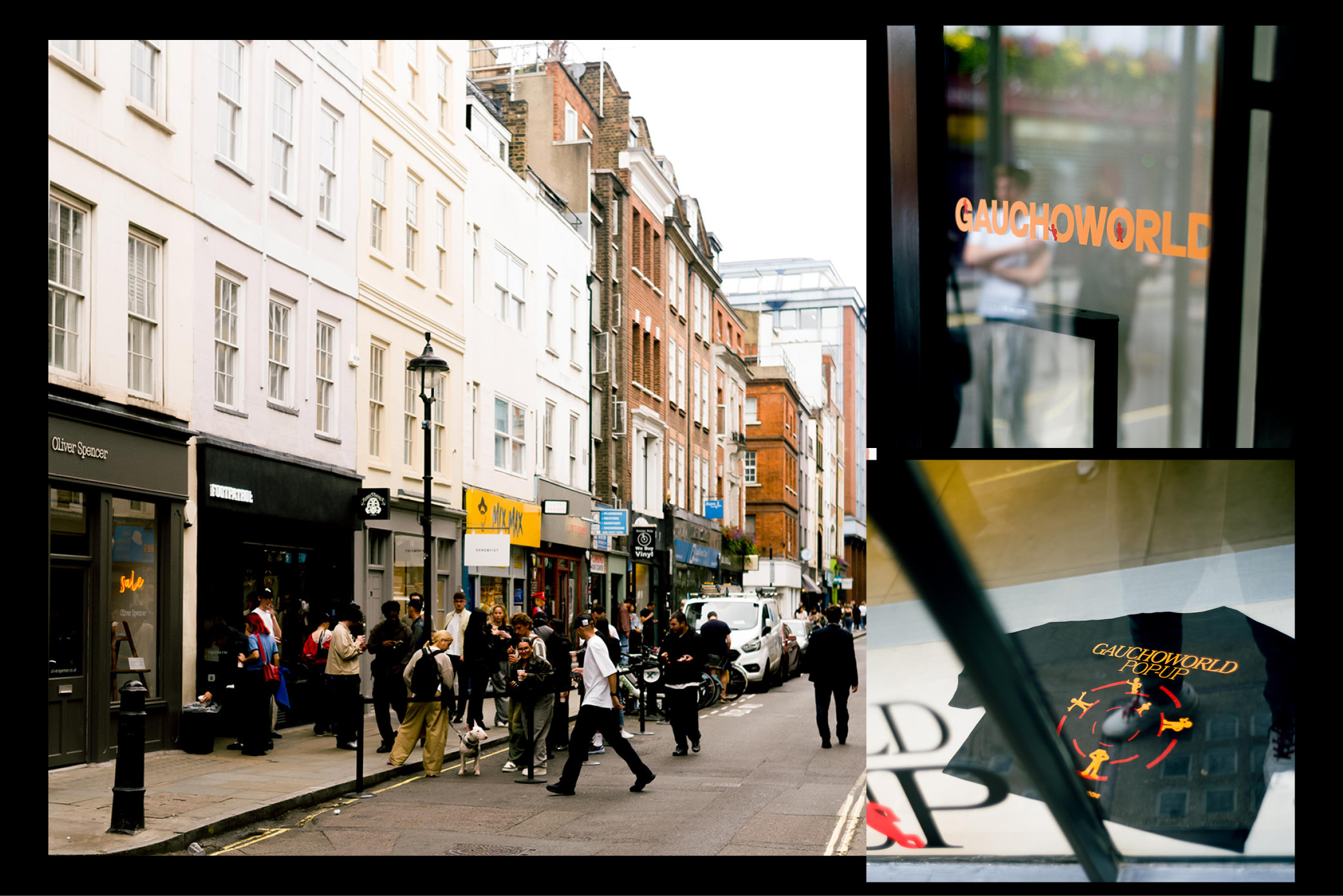
Over the last few years, we’ve become big fans of London based magazine Gauchoworld. We’ve used our platform as a way of spreading this voice and highlight the creatives, artists and athletes to talk further discuss the culture we’re apart of.
For their latest issue launch, founder Dean George brought the Gauchoworld party to the streets of Soho with a pop up at Footpatrol London. With drinks by ‘Mirchi’ and sounds by @raaandy.zip, @leonparara and @rickinzi, a good evening was had by all!
Take a closer look below and we hope to see you at our next store event soon.


A multidisciplinary artist captured by the soundscape of Western diaspora, paired with his tongue-spoken Youruba that stems back to his Nigerian roots, Demigosh is one of the few artists that continues to pave his own lane within the music landscape. With sounds that go far beyond the slinkiest of beats, exploring hard-hitting topics of intimacy, relationships, and influences of vices.
Following the listening party, we hosted in-store for Demigosh earlier this month, the multidisciplinary artist now takes the FP hot seat, sitting down with us to discuss his aspirations behind his musical talent, background as well as unlocking the meaning behind his latest single ‘Good without’.
Read our exclusive interview with Demigosh below!
FP: Demigosh, great to be sat with you again following on from the listening party we hosted in the store. How are you feeling about the single launch?
Ade: Thanks for having my dude! I’m feeling really good about the launch. I’ve been sitting with the track for a long time so I’m happy to finally be able to share it with the world.
FP: Delving deeper into yourself quickly, for those who didn’t attend the listening party. Could we give a lil synopsis into who Demigosh is?
Ade: Demigosh is a multidisciplinary artist. I was born in Nigeria, raised in Ireland and currently based in London. I tend to write my music like scores to a movie, often drawing from my own lived experiences as a diasporan navigating western culture, intimate relationships, influence of vices etc. whilst trying to retain some connection to my motherland (i sometimes speak my mother tongue yoruba in my music). Before this release i would have described my sound as a cross between Spooky Black (Corbyn), Lagbaja and Vangelis’ Blade Runner Soundtrack, but now i would say my new single and what’s coming sounds like a blend of Sade, Sylvan Esso and Francis and the Light.

FP: So as mentioned, we had you in-store putting on a performance like no other. Teasing lots of new tracks, reminiscing on some of the old ones. How did it feel, could you shake off the cobwebs?
Ade: It felt really really good. As I mentioned before I have been living with the new tracks for ages now so being able to play it out loud for people to hear and then seeing their reaction and feedback in real time is literally priceless. I haven’t performed a solo show in almost a year now so it was a great way to kind of get back into it, and a reminder of why I love doing what I do.
FP: Talk to us about this latest single releasing next week. It seems to be in a new direction in terms of sound compared to your previous work?
Ade: Yes, Good Without is out next week and it’s definitely a completely new direction for me. Every song on the project is. Good Without captures a time in my past where I was literally going to break up before it actually happened. I retained my cinematic approach to writing so the song is like the soundtrack to that moment I realized the relationship was over. Fun fact though I didn’t end it they did but i was very ok with that lol.

FP: What gave you that momentum to shift your sound?
Ade: Um i think it was bound to happen, shifting the sound was always the plan. My previous releases helped me find my voice as a solo artist. I was able to explore sounds that influenced me the most and blend them to form a truly unique identity which allowed me to break through the noise and connect with my people. So this shift felt like a natural progression.
FP: Will this be a new sound we can look forward to hearing more of from Demigosh?
Ade: To be honest, I’m not sure. But I’m very happy here for now.
FP: Let’s talk about 2023 plans. Is there anything else we can look forward to from you this year?
Ade: A whole lot of music this year. I’ve got this project coming and collaborations with some really talented artists.
FP: Demigosh, it’s been a pleasure to sit with you and talk more about your upcoming works. Before we let you go is there anything you would like to say as a way of signing off?


Puma head to the archives and re-issue a shoe that was formally known as the Puma Wimbledon, a tennis shoe from the late ’70s. With Wimbledon being the oldest and most prestigious tennis Grand Slam Tournaments, Puma play on the traditions of Strawberries and Cream, with a colour way that represents this. We had the chance to take these to the court and put them through their paces.
Now available to shop online at Footpatrol here.


Footpatrol has retreated to the wild with our latest collaboration with eyewear brand Oakley. Drawing conceptual influence from the ecosystem and habitats that surround our everyday biosphere, we delved deep into the biodiverse landscapes, in particular, bugs and how they play an impactful part in all cycles of life – no matter how big or small.
Pulling out evolutionary cues from the Minotaur beetles we looked toward capturing the texture, colour, and microscopic intricacies from the species. The frame is readied in an opaque black to clear transparent gradient design, with the black colour tone reminiscent of the Minotaur beetle’s hard shell exterior.
The transparent element of the gradient design is a nod to the sheen that reflects off the beetle body. Footpatrol bar logo branding appears on the bridge, and the Prizm Road Jade-coloured lenses deliver a blissful contrast with complimentary laser detailing etched around the perimeter of the lens; a detail referencing the horns of the Minotaur beetle.
Each set of sunglasses comes complete with a custom printed dual-branded micro bag and Oakley’s universal eyewear leash that snaps on the end of your frames to keep them firmly in place.
Available in-store and online, priced £195.
Please note, T-shirts will only be available in-store as part of a gift with purchase when you purchase this collaboration in-store. These won’t be available for sale.


A multidisciplinary artist captured by the soundscape of Western diaspora, paired with his tongue-spoken Youruba that stems back to his Nigerian roots, Demigosh is one of the few artists that continues to pave his own lane within the music landscape. With sounds that go far beyond the slinkiest of beats, exploring hard-hitting topics of intimacy, relationships, and influences of vices.
To celebrate Demigosh’s musical accomplishments so far, we are hosting an in-store listening party that captures the essence of his new sound.
Debuting his new single ‘Good Without’, his latest masterpiece is a hybrid Spooky Black, Lagbaja, and Vangelis’ Blade Runner Soundtrack, with a narrative that follows the beginnings of a breakup.
Join us in-store on 13th July from 18:00pm till 21:00 for a listening experience like no other! Please just RSVP to RSVP@Footpatrol.com and we’ll be in touch prior to the event to confirm attendance.


For those who don’t know, as his cleverly NTS Radio show is named, ‘You’ll Soon Know’. For our next Frequent Players, we tap into the world and mind of product designer and DJ host, Tim Parker.
Creative both through his practise as well as his DJing, Tim steps up to the decks for Guest Mix 43 bring his varied selections to the sounds of Frequent Players. We catch up with the man himself to touch base on him, his creative thinking and how that leads to his music.
Footpatrol: Hey Tim, we hope you’re well? Thanks for letting us come and talk to you today. Could you start by telling us a bit about yourself and what it is you do?
Tim Parker: I was born in Cambridge, but I have been a resident of London for around 15 years. I have been a DJ for around 17 years – although I have lost track of the exact number of years at this point, haha. In addition to my DJing, I work as a digital product designer during the day.

FP: What is it specifically about product design that intrigues you?
TP: I have always found technology and the internet interesting. Moreover, in my job, I get to exercise my creativity, solve lots of problems and continuously learn new tools and techniques. I get bored quite easily, so the fact it moves at a fast pace works well for me.
FP: Also aware that you study Japanese? I know this isn’t something you can do half-heartedly, what made you want to learn a language? And what’s the hardest part about it for you?
TP: It was around the time when I had been working at Mixcloud for six years, and I wanted a new challenge, but I wasn’t ready to leave just yet. Having hit the age of 30, I realised that I had never truly spoken another language beyond the basics I had learned in secondary school. I had taken a couple of trips to Japan and loved the place, so figured ‘why not try Japanese’?
Although the hardest part has been staying motivated, it’s taught me a lot about self-discipline. At this point, I have invested so much time and effort that I am not willing to give up! Haha.
FP: The NTS Tim Parker ‘You’ll Soon Know’ show has been going over a decade now, quite an achievement and congrats! (it’s always on in the office) how has the show evolved over the 10+ years? and how do you decide what goes into each mix?
TP: I feel the show has evolved a lot in 12 years, but at the same time I feel nothing has changed! When I started the show it was a graveyard shift from midnight to 2am on a Monday, I was new to radio and NTS was just starting. I’ve had the pleasure of learning from many greats around me, refining my skills and becoming more confident in what I do as the station has grown to the point where I’m able to be on at 1pm, not 1am! Musically, however, it was the same ethos then as it is now – play the music I like, how I like to play it.
Oh and that’s dope you guys are listening in, thanks!
FP: Is there a plan to release any future EPs?
TP: I wish I could say yes, but I need to get my act together and make more music! I feel creatively ready, I just need to make it happen…
I have a couple of draft bits with IvyLab we need to jump back on, as well as a couple of collabs with Deft which are close to being finished. Hopefully, those will see the light of day this year.
FP: We’ve also seen you’re pretty nifty with a camera too, is this something you enjoy doing in your spare time? What’s your go to camera and any influences in this field?
TP: I have always enjoyed and appreciated photography, especially while travelling. Although having an iPhone in my pocket was great, purchasing a Ricoh GR3 a few years ago helped me regain the purpose of my photography that I had lost since finishing university. It’s nice to carry an actual camera, and I quite like the GR’s constraints. If it had a ton of accessories, I would be fiending for more gear or struggling to make decisions!

I have so many photography inspirations that it will be hard to name just a few. My buddy Repeat Pattern recently released a dope new book collaboration that you should check out. I love all of his work, and I enjoy shooting with him on our adventures in Japan. Lakehills has been a visual inspiration, especially his recent work on the IvyLab live show, which is breathtaking. Masataka Nakano, Greg Giraud, Johny Pitts, and Ryan Lafferty are a few more names I’ll add to the mix.
FP: You’ve a got a Vancouver show coming up in July? Can we see you residing at any events here in London this year?
TP: As of now, I don’t have anything concrete lined up in the UK. I haven’t done a great job of putting myself out there for shows, and I’ve been slacking with releases. However, I have been talking with a few of the crew, and there’s talk of getting something semi-regular going. Let’s see if that happens; it would be fun.

I’m very fortunate to have been invited back to Basscoast, just outside Vancouver, in July by the amazing Basscoast team. It’s truly one of the best experiences, and it’s located in an area I absolutely fell in love with. I’m eager to be out there now and excited to see everyone!
FP: Thank you very much for taking the time to chat with us Tim, if there’s any shoutouts you wish to make or words of wisdom on people looking to get into product design, learning a language or DJing, the floor is yours!…
TP: Maybe not that much wisdom, but getting started is often the hardest part, once you get the ball rolling just try to keep progressing even if it’s slow progress – it all stacks up after a while.
Shouts to you guys for doing your thing and having me be a part of it. Big up to everyone who listens in to the show or checks out the mix. If you aren’t familiar, tap in – https://nts.live/shows/youll-soon-know. Peace!


Over the last twenty years, Footpatrol has become well known as a hub for sneakers but for ’23 we’re adding a range of apparel brands to our arsenal and the first of those has arrived in the form of Seoul based, thisisneverthat.
Known for their graphic elements, the brand bring a new lease of life to the traditional world of streetwear and since their beginning way back in 2009, have built up some what of a cult like following. Originally an underground favourite, the brand continued to push themselves to which in 2018, they showed for the first time at Fashion Week.
To celebrate, we take a look at some of our favourite pieces from their latest collection which is now available to shop online at Footpatrol here.