Author: Bradley Martinez

Sitting down for our latest discussion, we talk to Jason Faustino who for the last year and a half has worked as marketing manager of at Saucony’s Original brand.
Having originally co-founded the iconic Extra Butter store in New York, we managed to catch up with Jason about this time in his life and how it’s led him to where he is today. From designing Saucony’s collaborations with Extra Butter to what they have to offer in the coming years. Jason gives a great insight into this historical brand.
Footpatrol: Hey Jason, hope you are keeping well during these times! For our reader please can you introduce yourself and what you do over at Saucony?
Jason: I’m Jason Faustino, I’ve been at Saucony for a year and a half as the Marketing Manager for Originals at HQ in Massachusetts. We’ve got a pretty lean team, and I’m lucky to have been able to support the team on product and overall Originals brand strategy.
FP: Prior to joining the team at Saucony you were one of the co-founders for iconic New York store Extra Butter.
Can you tell us a little about your time there and how it led to where you are today? Did you work on the colourways and themes for some of the Extra Butter x Saucony collaborations?
JF: My experience in starting that company definitely prepared me for my time now at Saucony and we had a lot of success with the brand during my time. I actually began working in footwear through a mom & pop store, where I met a Saucony sales rep – Eddie Joyce, who was my first real intro to the brand outside of knowing a style or two. He put me in my first running shoe which was the Saucony Pro Grid Triumph 4 in gold. And, I got my first taste of the role of a buyer placing orders with the brand. As a former b-boy I remember being so excited being able place orders for the Saucony Courageous in a special version by legendary breakdance crew – The Floorlords.
I did concept and ideation on all of the EB x Saucony collabs, including another pack that may or may not be on the way in the future. I’m often asked which my favorite is and from a wear standpoint it’s the Shadow Master based on astronaut ice cream which was ⅓ of the “Space Race” pack. But from a conceptual standpoint, I’m most proud of the “For The People” project. Always maintaining a close relationship with customers I thought it’d be cool to bring them as close to the collaboration process as I could, allowing them to vote for and be in on every aspect of the project from reviewing samples and making changes on color and materials. I feel it was in the beginning stages of crowdsourced design, and I’ve always been thankful to Saucony for letting me run with that concept.
FP: Saucony is a brand that’s been around for well over 100 years and i feel people still have trouble with the pronunciation to this day. Please can you elaborate how the brand got its name and how it’s evident within the logo?
JF: Explaining this always gets the best reactions from “a-ha” moments to leaving people in utter disbelief that they’ve been saying it wrong their whole life. The name is derived from the Saucony river in Kutztown, Pennsylvania. Pronounced “sock-a-knee” as the brand had on various ads and even boxes over the years to emphasize it’s correct pronunciation, the name is derived from the Native American word “saconk” – where 2 rivers run together, a concept that served as the inspiration for our recent Courageous Moc collaboration with Lapstone & Hammer. The logo, and all of it’s versions you’ve seen on the side of the shoe represents the river, with the 3 dots acting as 3 boulders in the middle of the stream. You asked me during a great time considering we just did a deep dive into a re-branding of sorts, and have recently unveiled a new logo, that focuses in on those 3 boulders, while still keeping the curvy “S” looking river logo as well.
FP: In its early years, Saucony were pioneers in running shoes, a key area of the business still to this day! But it wasn’t until the 1980’s and the arrival of the Originals Era where things really ramped up. Can you shed a little more insight into Saucony Originals during its early years?
JF: I’m not entirely sure how “Originals” came about, but if I had to guess it’s because runners were still choosing to run in the older models. Even today, our brand can put out the best running shoe on the market, full of amazing technical specs and modern advancements, and still you’ll find casual runners who prefer to delve into the archives and run with one of our past silhouettes. I think it speaks to the strength of the brand’s design language through the years, but also the craftsmanship. There’s no such thing as an uncomfortable pair of Saucony’s so while technology has changed over the years, the comfort and fit has always remained. I think that gave good reason to retro some fan favorites and create the category of “Originals”, transitioning functional athletic to fashion style with the most popular style leading the charge for the brand in the 1981 Saucony Jazz.
FP: Originals with its lifestyle approach and limited collaborations is what our consumers have known and loved over the years! For the consumers reading can you shed a little more light into how a collaboration can come to light and what its like working on the process?
JF: I’m happy to share because this somehow still remains somewhat of a mystery to footwear enthusiasts. It’s almost always based on relationships. Even if you don’t have an existing relationship with the brand, it’s how you go about developing one and from there maintaining it, being able to show a true enthusiasm for the brand, as well as having something to offer on your side that attracts the brand to working with you in a more meaningful way.
I can say that the process has tweaked a bit just recently.. As of last week, Eric Smolin (Originals Product Line Manager) and I declared that we won’t be taking in any more collaborations or projects unless they have a do-good component, give back, or spread awareness for a worthy cause. Our brand platform is “Run For Good”, it has a few different ways it can be looked at and interpreted, but if we extract the literal aspect of the “for good” piece, we want our projects to do just that and be a beacon of goodness, rather than just an opportunistic moment of combining logos and manufacturing hype. There is enough hype in our industry and I’m not knocking it because we love that energy, but we need to do our part in doing more good for our world and our people, so it starts with us.
FP: Saucony Collaborations i feel are known for telling a story or displaying a strong theme via the shoe itself, through the marketing campaign even down to the special packaging and store installations. Why is this all round experience so key to a project launch?
I always felt that love is fleeting in regards to projects without a story. Strength of design certainly means a lot, as well as what a brand stands for, but having a story to be told through the shoe’s design itself, it’s packaging, or the events and marketing attached – that connects the emotions. You don’t forget emotions – especially when connected to meaningful stories or even fun moments and reasons to celebrate in general. The highest level of design and marketing can achieve that energy and vibe communication without needing to spell it out.
Models like the Shadow 5000, 6000 & the Grid 8000 for example have been key to these collaborations over the years. But in the last year or so we have started to see more archival models return with partner collaborations and inline launches with the likes of the Grid Web and Azura 2000 most recently.
FP: How have you decided on what to bring back and how has the process been in bringing them back to market?
Eric and Josh Fraser (Originals Designer) deserve all the credit for the 5 archival styles that have been brought back over the past year – Azura, Jazz 4000, Aya, Grid Azura 2000, and the Grid Web. The process is a long one, the brand hasn’t kept original molds for all the shoes in it’s archive, so each silhouette had to be brought back from scratch. It starts with obtaining an original pair, from there it’s working on so many levels with our expert team of designers and product developers in conjunction with our factories to bring the shoes back to life close to it’s original, but still meeting today’s brand standards. The decision to expand the line with those 5 bringbacks was one of the major reasons for my interest in working at Saucony. I’ve always felt that Saucony’s archive is a full arsenal of bangers, and the decision to start bringing back models to team up with it’s established classics was the key to diversifying our consumer and taking the brand to new heights..
FP: Within the Saucony brand there is so much technology on display with the likes ISO and EVERUN collections to the customisable elements of the Mad River TR. With technical footwear, even trail running becoming more and more fashionable, are there any plans for these models to see the likes of store or partner collaborations?
JF: I love this question – it didn’t even need to be a plan. Without prompt some some of our partners seek out our trail and performance products because they’re just that good. White Mountaineering showed interest in a personal favorite of mine, the Switchback ISO, a minimalist trail shoe with a boa lacing construct. From there they created their own colorway dropping later this year in accompaniment to 2 Grid Webs as well. We’ve also got other partners that are cooking up some special Originals and giving their take on performance products.
Outside of partners our brand has given our team the freedom of giving performance and trail product the “Originals” take on it, afterall, once a product comes out with a new version, the 1st one then becomes an original. I’m leaking info here a bit, but I’ve brief in a 4 shoe pack that combines 2 trail shoes with 2 Originals inspired by Astrology. It’s a love of mine but also something I felt connects with our community’s constant pursuit of exploration, whether it be in the world, through various creative arts, and of course knowledge of self..
FP: While we have all been spending a lot more time indoors lately, we have all been missing our sneakers! A question we have liked asking lately is what would your go to footwear be for each of the below:
Working out – Endorphin Pro. People think new running shoe technology isn’t much different than previous versions, but not the case here. This shoe is truly like nothing else and an absolute beast.
Casual every day – The Jazz – forever a classic and looks good with everything.
Impressing someone – Grid Azura 2000, the design is as eye catching as it gets.
Staying at home – The Aya, if you’ve slept on it, they feel like slippers, in fact they feel lighter than some slippers, so comfy.
Travelling – Grid Web, I love that heel cushioning, but I cover having something unique that will stand out as well with any version of that shoe.
FP: Jason, thank you for your time speaking to us today! To close out can you just let us know what you are currently doing to keep active and inspired during these difficult times and what we can expect to see from Saucony throughout the rest of 2020 and into 2021?
JF: Thank you! And thanks to anyone reading, Foot Patrol has always been considered by me to be a legend in this industry so it’s an honor (Only in Soho Shadow 6000 Size 12 😉). As for these unprecedented times, I haven’t been as active as I would have liked to be physically but I’ve been incredibly active on the work front as I think we have a lot of good stuff in store. I need hockey rinks and movie theatres to open back up for me to keep myself busy otherwise, those are my sanctuaries. Other than that, I’m already a homebody and an introvert, I felt now was a good time to take it back to my upbringing where I soaked in movies and music in a different way, more intimately. I feel at various stages of my life, when I’ve connected deeper to those arts, it’s only set me up for years ahead to be able to do what I do with love.
As for what you can expect from Saucony – hopefully something that continues to make change and progress every single day. Especially in light of the awful injustices going on in our world, it’s forced us to take an even closer look into who we are, and what we do. Saucony is about it’s community and we want to do a better job of not just being a part of it, but being a leader. One thing you can look forward to that’s more tangible – the proper celebration and heroing of the brand’s most iconic shoe ever – the Jazz, with it’s 40th Anniversary coming in 2021. Thanks again for this opportunity, my love to all!
Thank you, Stay Safe!
#TEAMFP


The last in the long lasting relationship between adidas and Kanye Wests YEEZY line, the QNTM has become one of the high anticipated launches between the pairing.
Going more down the styling root of the 380 and latest 700 v3, the QNTM ‘Barium’ features a layered silhouette comprised of a jacquard underlay, whilst like that 700 v3, a RPU cafe sits on top, wrapping its self around the upper for structure and durability.
Reflective material’s are located throughout the jacquard quarter panel and heel counter emits light within darkness. One of the most loved materials within a lot of the YEEZY range is a BOOST midsole, this to finds its way into the YZY QNTM, elevating the the cushioning experience providing optimal comfort where consumers need it most. A semi-translucent clear TPU cage wraps the Boost and adds a distinct design element to the model while the herringbone patterned rubber outsole offers optimal traction.
To sign up to the IN-STORE (London & Paris) raffle, CLICK HERE!
To sign up to the ONLINE (UK Applicants only) raffle, CLICK HERE!


Nike return to classic team colours for 2020 on a silhouette that has reigned supreme since 1985. Ever since this introduction with the ‘Be True To Your School’ pack, that saw top Nike sponsored universities receiving their own Colourway, the Nike Dunk has worked its way to icon status. Now for Summer 2020, Nike return to some of these most iconic colour ways.
Kicking things off last month with the introduction of the ‘Brazil’ which was then swiftly followed up with a the iconic University Red and White, a classic combination that pays homage to the Dunks earliest days.
Now, we return to The University of Virginia Cavaliers’ navy and orange colour scheme, dubbed ‘Champ Colours’ due to winning the NCAA Championship in 2019.
To enter the IN-STORE RAFFLE (LONDON ONLY), CLICK HERE!
In-store raffle – You’re required to sign up to the above raffle form, this will not be available in-store to sign up on. One entry per person, multiple entries will be cancelled. Winners will be notified via email.
Currently, the store is operating via an appointment only system. Creating an appointment is essential to collecting your win. DM us on Instagram to create your appointment.


One silhouette that has seen a range of releases already this year, the Air Jordan III is back for its latest. Following on from the ‘Fire Red’ release from earlier in the year, we now take a look at a similar colour blocked iteration, this time however in a Varsity Royal.
The upper has been constructed in an all over tumbled leather with complementing blue Jordan logo on the tongue.
To enter the ONLINE raffle (UK applicants only), CLICK HERE!
To enter, you’re required to sign up via the above form, this WON’T be available in-store to sign up on.
Online raffle winners will receive a special code in which they’ll have a limited time to purchase their raffle win via a unique link. The raffle is limited to one entry per household! Multiple entries will be cancelled!


For our latest Footpatrol Discussions, we sat down with Vans Vault legend, Taka Hayashi. Continuing to bring his unique craftsmanship to the Van’s Vault line ever since his first coming together with the brand back in 2005, Hayashi brings his keen eye for detail to his latest SS20 collection taking iconic Vans details and making them his own.
Read what Hayashi had to say about his journey and how he came about ending up with his own name line.
Footpatrol: Hey Taka, hope you are keeping well! Thank you for taking the time to talk with us today. For the readers who may not be familiar with yourself could you give a short introduction into who you are and what you do for VANS?
Taka Hayashi: Hi Sam, happy to talk to you! I’m currently the head designer for Vans Vault. I’ve been designing Vault since 2006. I was born in Yokohama, Japan and moved to California as a young kid, where I grew up skating and making art. I currently live in Los Angeles.
FP: Can you tell us a little about your design background? Before shoes, I read that you had your own t-shirt label stocked in Union? And worked on designs for the likes of stussy?
T: Before my time at Vans, I was initially a graphic designer/ illustrator. I had my t-shirt line stocked at Union and Supreme. I also worked for Stussy as a graphic designer and illustrator.
FP: From there you did your first project with Vans in 2005 and began working full time shortly after? How was it in those early years working at VANS? Surely so much to learn yet living the dream for someone who grew up skateboarding in California.
T: It was right after the launch of my Syndicate project in late 2005 that I received an offer from Vans to work on the Skate line. it was a dream to work for a company that I grew up with and respected. It was a lot to take in and adjust coming from a graphic design and apparel background. In the early years, the changes were already happening with all the heritage classic models coming back with the launch of the Z-boys documentary. I think the Z-boys story really helped with the importance of the Vans roots in skateboarding. It was cool to see alI the kids romanticizing of that era and rocking slip-on’s and authentic’s. I also remember around 99’, thinking how cool and rebellious Geoff Rowly looked skating in red authentics. It was so fresh to the eyes since all skate shoes at the time looked so bloated.
FP: You are now the Head Footwear Designer for Vans VAULT and have your own name line of product for the brand. From your experience of hanging out in Skateshops and designing t-shirts to where you are now, what advice would you like to give to the next generation who are trying to make their way in design?
T: Immerse yourself within your area of interest. Connect with people who have similar levels of creativity & passion. Keep working hard at what you’re truly passionate about whether it’s graphic design or fashion. Don’t be afraid to take risks & make mistakes, as good things tend to come out of it. Make sure to stay mentally strong and don’t fall off your path.
FP: Onto design itself you work across core vault lines, collaborations and your own line. How do you differentiate your approach to each project?
T: It was difficult at first trying to focus on numerous projects, but through time you learn to manage and differentiate each project by switching your design mindset. I usually start off designing the new models for my capsule, inline Vault, and bringing back a few of the silhouettes from the archive. Then I move on to colors and prints for the Originals, Vlt, and my signature TH capsule. At the same time, I’m working on collaborations, which probably takes the most time since it’s through partnership.
FP: The Taka Hayashi line to me is one we have stocked at Footpatrol for years and each season it seems to evolve yet remain true to itself with influences drawn from travel, craftsmanship, native american culture and the Ainu people of Japan. What are the first steps you take when commencing upon a new season?
T: Usually, I start off with travels, visiting the local flea markets, and checking out bookstores. Music is a huge part of my life, & is very inspiring to my design. Many of the influences mentioned above are already ingrained in my design aesthetic. It’s about adding and updating to that look, giving fresh perspective. I think then, you still stay true to what you’re known for.
FP: Many people would say a pair of VANS gets better the more it’s worn, skated in, worn to a party, etc.. Yet a pair of Taka Hayashi Vans with their premium materials and intricate details are somewhat the pair I imagine a skater switching to for an occasion. Do you design the ranges with a specific audience in mind?
T: Vans do get better worn in, especially in canvas. It adds character to the shoes. With my collection, I think about the Vans audience who want the heritage look, but with extra details, premium materials, and unique color combinations.
FP: You have a new collection launching very soon, featuring the Style 98 LX, SK8-Lo Reissue LX and Style 47 LX, some models that may have not been seen for some years now and they are dressed in a QR code inspired print. Can you shed some light on this collection and why these models? Will we see more of them filter down into the wider VAULT range?
T: The Style 98 LX is a model that I brought back from the archive and reworked. I was drawn to the interesting paneling and the aesthetic of the late 90’s skate shoe. The Style 98 now sits on a modern last to give more of a sleek sculpted look with added details. I kept the materials and colors simple with a premium aniline leather and suede since the shoe itself already has a lot going on with details and paneling.
The Sk8-Lo Reissue is something that I reimagined as it were designed in the 80’s along with the Sk8-Hi. We had sk8-lo’s from not too long ago through the Skate and the Classics category, but never with the thinner eye row panel. I also updated the design with a sculpted collar and heel to give a bit of the retro football cleats look. The medial side has metal vent holes for extra breathability. The graphic was inspired by the QR code, which was invented in Japan, and our heritage checkerboard print. I thought the connection of the two graphics were a perfect blend since it pays homage to Vans and to the Japanese designer who created the QR code.
The Style 47 is also brought back from the archive and reworked with added details. I love this silhouette because of the multi functionality. The heel folds down to a mule which is great for traveling through airports where you often need to take your shoes off or on quickly. It’s also good for just running quick errands outside, whether you go water your plants outside, or bike ride to the corner market. Overall, it’s an easy effortless shoe with style. The materialization of the shoe is inspired by the vintage Czech military liner with hits of rubberized screen print on the heel seams to stop slippage when folded down. Military style webbing with vent holes were added on the medial side for the upcoming summer months.
FP: Given everything that’s currently going on in the world right now, i am particularly impressed with the community spirit, the challenges, the competitions, the live workouts and so on. I think it’s amazing to see people coming together through hardship. What are you currently doing to keep active and inspired during these times?
T: I think it’s amazing to see many communities coming together and helping one another. I hope the community spirit stays strong post covd-19. Since lock-down, I’ve been going through my library of books and researching online to stay inspired. To keep active, It’s a shuffle of going on bike rides to the beach, skating, or taking a long walk around the neighborhood.
FP: And given its trainers that brought us all together originally and we are all spending a lot of time indoors lately. We would like to know what your go to is for the below:
Working out – Authentic/Slip-ons for skating
Casual every day – OG Vans Style 47 (Changes seasonally)
Impressing someone – vintage made in USA Vans or TH shoes
Staying at home – Babouche slippers
FP: Taka, thank you for taking the time out to drop knowledge with us today! Would you have any last words for the readers?
T: Thanks for reading and thank you for the support.
Thank you,
Stay Safe,
#TEAMFP


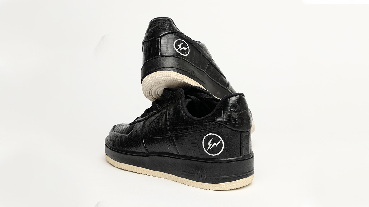
After taking us through a selection of his top five bespoke Air Force 1’s, Mark Whitfield is back to do a part two within our Footpatrol Meets series.
This time however, he makes it a little different by showcasing six rare sneakers within his collection… without straying too far away from the Air Force 1 silhouette of course!
This latest collection takes us through some very highly sought after pairs and also some, that you may not have seen before? Being a professional photographer, Mark has kindly gone to the effort of creating some detailed for us to all admire.


After a sneak peak earlier in the year, we finally see the arrival of the Air Jordan 4 ‘Red Metallic’.
Having been shown in an array of colour ways since its launch in 1989, the Air Jordan IV has made its way into the iconic sector. For Summer 2020, Jordan Brand take it back to basics with a perfectly put together iteration that’s dressed in a stark, all white leather disguise.
Giving the details a burst of live, the AJ4 receives a welcome dash of colour via its University Red metallic tongue, lace cage and heel.
To sign up to the ONLINE RAFFLE (UK Applicants Only), CLICK HERE!
To enter, you’re required to sign up via the above form, this WON’T be available in-store to sign up on.
Online raffle winners will receive a special code in which they’ll have a limited time to purchase their raffle win via a unique link. The raffle is limited to one entry per household! Multiple entries will be cancelled!


With its anniversary, Nike have been revisiting past colour ways and new, showing the versatility this silhouette has to offer with this latest iteration in a striking example of that.
Though jewellery isn’t a new thing to be seen added to a Nike, (you only have to think back to last years collaboration with Comme Des Garcons for another example) the removable bracelet blends perfectly well with the amazing mix of earthy tones within the upper.
To sign up to the ONLINE RAFFLE (UK Applicants Only), CLICK HERE!
To enter, you’re required to sign up via the above form, this WON’T be available in-store to sign up on.
Online raffle winners will receive a special code in which they’ll have a limited time to purchase their raffle win via a unique link. The raffle is limited to one entry per household! Multiple entries will be cancelled!


Not frightened to express itself in vibrant colours, the ‘Rage Green’ is the next instalment into the Air Jordan 1 ‘Zoom’ franchise.
Keeping that same, instantly recognisable design as the iconic AJ1, the ‘Zoom’ takes the comfort levels up a notch with a full length zoom unit underfoot.
Having previously released in a clean all white/grey with vibrant bursts of blue hues, this latest iteration features a black leather upper with pops of green in a hairy like suede.
To sign up to the ONLINE RAFFLE (UK Applicants Only), CLICK HERE!
To enter, you’re required to sign up via the above form, this WON’T be available in-store to sign up on.
Online raffle winners will receive a special code in which they’ll have a limited time to purchase their raffle win via a unique link. The raffle is limited to one entry per household! Multiple entries will be cancelled!


After the recent release of the Air Jordan XI ‘Gym Red’ iteration, the silhouette is back but this time in a ‘Concord’ Colourway that is especially for the women sneaker heads out there.
Designed by Tinker Hatfield, the AJ11’s came with inspirations of a drop top, luxury convertible with its bold sweeping leather mudguard being its stand out feature. Sticking to its classic use of colour blocking, this ‘Concord’ iteration sticks with a rich blue across the centre piece whilst the rest of the upper is finished in a stark white leather.
To sign up to the ONLINE RAFFLE (UK Applicants Only), CLICK HERE!
To enter, you’re required to sign up via the above form, this WON’T be available in-store to sign up on.
Online raffle winners will receive a special code in which they’ll have a limited time to purchase their raffle win via a unique link. The raffle is limited to one entry per household! Multiple entries will be cancelled!


