Salomon celebrates 75 years with a fresh new look!
The Salomon story doesn’t start at Paris fashion week, but is the culmination of engineering, innovation and desire.
Post WWll, A newly liberated world returned to the mountains to ski, François saw an opportunity to adapt his skills in the crafting of saw blades , and started to make ski edges, or carres, which allow skis to turn sharply. But it was his son, Georges, who propelled the business forward. Having studied engineering, Georges’ first big idea was to build a machine to manufacture the ski edges, allowing him and his father to focus on developing ski equipment instead.

Georges came up with two game-changing ideas in the fifties, when skiers still used fixed leather straps as bindings, often resulting in broken bones as legs twisted with jammed skis. The first was a releasable ‘Skade’ binding, which attached to the toe-end of a boot; the second was a system he called ‘Le lift’, which allowed the bindings to release on heavy impact. Initially advertised as ‘Your guardian angel’, it eliminated a very literal pain point. Today’s ski bindings are still made with the same basic design.
By early 70s, Salomon was the world’s number-one binding brand, making 1 million of them a year. It branched into ski boots in 1979, with the forward-flexing SX91 in 1984 considered the most influential ski boot of all time. In the nineties, Salomon began making snowboards, skis, and Alpine hiking shoes, while Georges’ obsession with innovation saw him buy US golf manufacturer TaylorMade, whose founder Gary Adams had designed the world’s first metal driver.
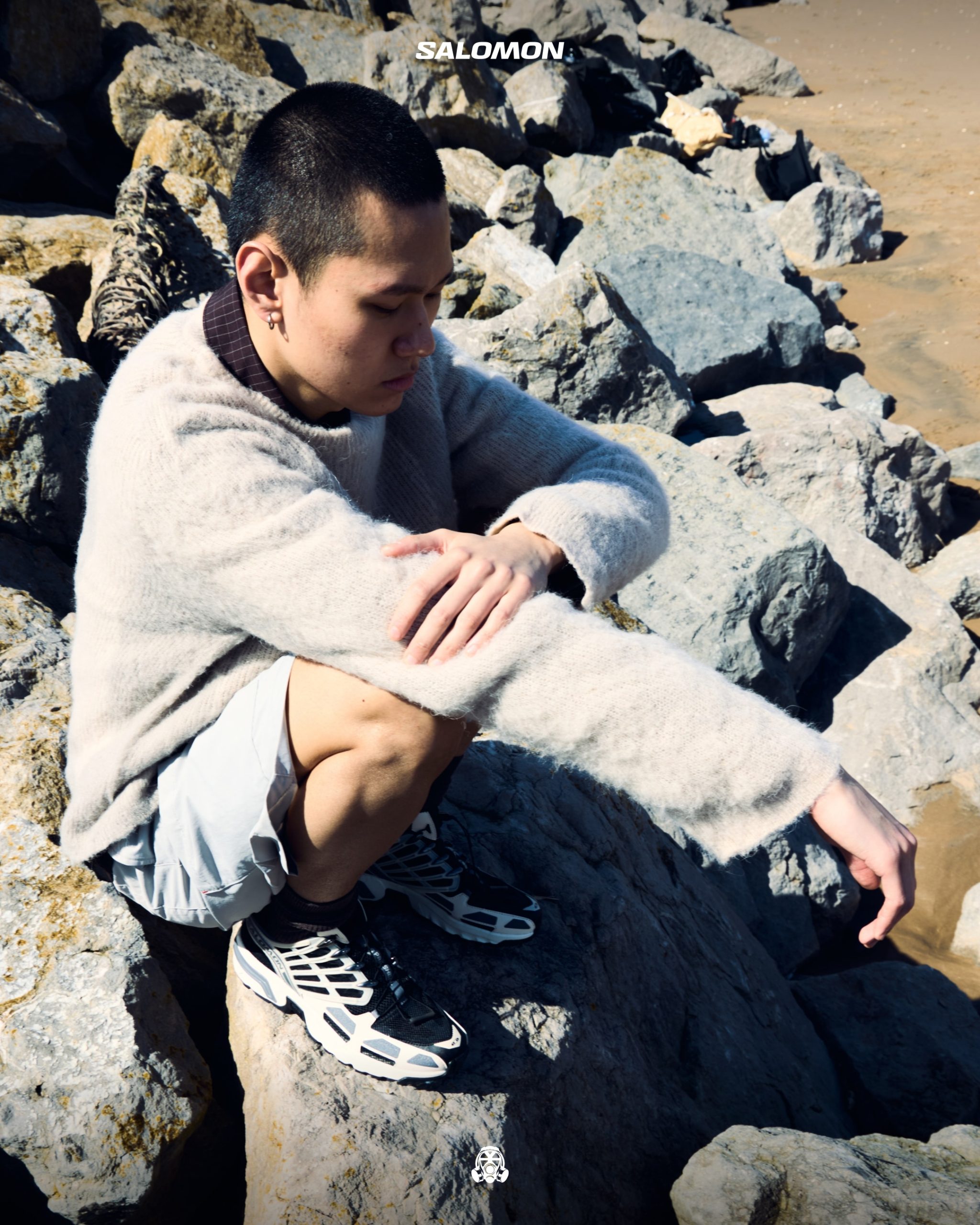
Salomon was just as well known for its shoes, worn by the likes of trail-running champion Kilian Jornet whose fastest-ever ascents of the toughest all-terrain peaks including Everest, Matterhorn and Mont Blanc have brought the sport to wider audiences.
XT what?

Until 2015, the idea of combining ‘fashion’ with the Salomon’ world might have left a sour taste in many alpine mouths. The bright colourways were designed solely for high visibility on extreme hikes and runs.
Soon, Salomon and The Broken Arm were working on a collaboration: the same core design as the Snow-cross, but with a new outer sole and a charismatic colourway. A series of seemingly surprising collaborations have then followed, starting in early 2016 with German menswear designer Boris Bidjan Saberi, known for his use of technical materials, who redesigned the iconic Speed-cross 3 trail-running shoe in all-black and all-white.
With a growing demand for lifestyle-focused shoes, that same year Jean- Philippe Lalonde joined from Veilance, the fashion-forward arm of Canadian outdoor brand Arc’teryx. His brief was to start a new Sportstyle division at Salomon, fusing street style with performance. The Advanced program that Jean-Philippe subsequently created largely kept the core shoe designs the same, but added bold colourways and design features.

EVOLVING THE LOGO
“This new visual identity is a great manifestation of our brand relaunch and true to our brand history and personality. The final design feels so natural and obvious, it is the best result the design team could hope for!”David Farcot – Creative Director for Salomon Snow Sports
The new “S” monogram and the new “Salomon” logo appear on Salomon products starting this Fall/Winter 2022-23 season.


Both were unveiled discretely in the exclusive Blue Fire Collection that launched in January 2022. Salomon aficionados might have noticed the design on Salomon skis and snowboards at the Beijing Winter Olympics.
The internal graphic designers had already worked on the ‘Salomon’ logo blueprint and were actually creating new products while participating in the logo creation with the external teams, so every new logo option was integrated into product design.

Benedek, a Salomon Snowboard team rider for 18 years, today runs a creative consultancy in Munich. He was one of the most well-known riders of his era, bursting onto the snowboard scene in the early 2000s by showcasing a rare combination of style and technical tricks. Benedek’s segment in the 2002 snowboard film Afterbang by Robotfood played a significant role in the progression of snowboard films and the overall culture of the sport.
The new Salomon logo is a subtle tribute to the brand history, but with contemporary updates. To begin the project, Salomon identified what it felt were its strongest heritage markers among several logo iterations from its 75-year history.

The design experience was unique for Benedek due to his connection with Salomon and because he felt he was working with friends.
“It was emotional to connect to a time of my life as a snowboarder that was very important and unique,” he said. “Then, from a design standpoint, there is hardly a brand that I work with that I know so well.”
With a strong subconscious grasp on the core of the brand and what the brand could be and what it can’t be, this helped push toward a logo and font that is authentic to the brand and a good place to look at the future.
The new brand-mark is a manifestation of Salomon’s design ethos, to be superior in function, with a very readable and recognisable sign. To be radical in design, with a very straightforward and simple aesthetic; and to be obsessive in style, with an extreme level of graphic refinement.
With Salomon’s Fall Winter collection now slowly hitting the shelves at Footpatrol, take a look at our latest new in’s here!