Covering the globe with our Footpatrol Discussions platform, our latest sees us on Canadian waters with artist/painter Kathy Ager. Capturing our attention with her unique blend of Baroque-style artworks with modern streetwear touches, Kathy’s artwork enters a new world of darkness that captures the imagination.
Now with her artwork grabbing the attention of NOCTA, Polo Ralph Lauren and Nike, we had the chance to catch up with Kathy to understand more about this unique style and where these ideas originated from.
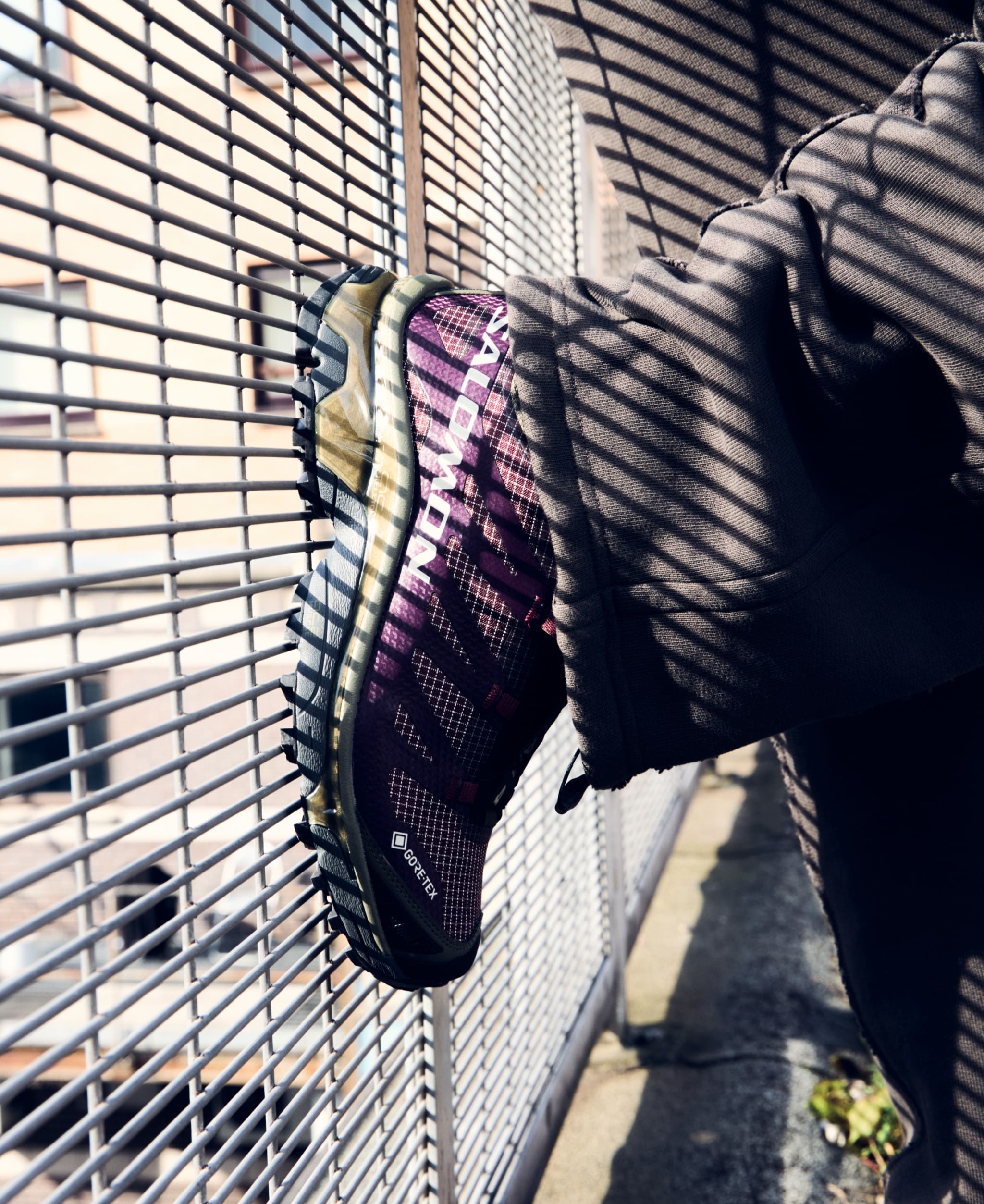
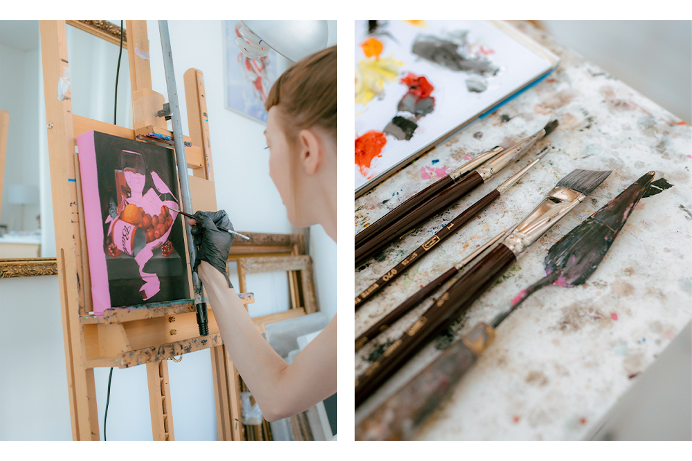
Imagery by @Samfidlin
Footpatrol: Kathy! It’s great to finally have the chance to catch up and talk about your work. We’ve long been wanting to feature so it’s good to finally have that chance. First things first though, how’s things?
Kathy Ager: Things are ok! I just returned to Vancouver after spending the summer in Amsterdam, so I’m still getting things sorted and up and running in my studio. It’s nice to be back though!

FP: I’m sure a lot of our audience would’ve come across your platform given the content you predominantly feature however, for those who may be new to your work, could you give us a bit of background into you and your artwork?
KA: Well, simply put, I’m an oil painter from Vancouver, Canada. I make still lifes that combine historically Baroque-style themes with modern elements. Sorry if that sounds too simple or dry! It’s just hard to sum up what you do when it’s only in hindsight that you can try to explain it and put it into a box. I originally went to school for graphic design and illustration and worked in ad agencies and design studios, doing mostly branding and packaging design. I moved from Vancouver to Barcelona to Amsterdam about 15 years ago, mainly because I loved European design (and I wanted an adventure!). I’m sure I was influenced by the art I saw around me, but it wasn’t until about 8 or 9 years ago that I picked up painting in my spare time. After a couple years of painting, I was picked up by Thinkspace, a gallery in Los Angeles, and from there I began painting full time. That was about 6 years ago! I returned to Vancouver to work on a couple solo shows for Thinkspace, and now I’m mainly working on my own pieces as well as collaborations with larger brands like Nike and Real Skateboards.
FP: You recently just returned back to your studio in Vancouver after being in Amsterdam for the group show, LAX / AMS’ THINKSPACE X STRAAT, how did it go?
KA: It was a great experience. I used to live in Amsterdam for almost a decade, but only started painting in the last couple years I was there and never felt like I made any inroads into the art scene. This group show happened to coincide with my plans to return to the city for the first time since I left back in 2018. I was so glad I made it to the opening as I got to reconnect with some old friends that are doing some big things in town and to make some new friends and connections in the Amsterdam art scene. It was also great to see the STRAAT Museum because it was still under construction when I left the city years ago. It’s a really impressive space.
FP: So, let’s get back to your work… ‘Golden Age’ is a term I see people use to describe your work quite often. It’s something we think has multiple meanings whilst referencing the inspiration to your style but we’d love to know what it means to you.
KA: My painting style is heavily influenced by the still life paintings of the Dutch Golden Age which spanned much of the 17th century. It was a time of crazy wealth in the Netherlands, mainly achieve through the exploitation of other places and people, and there was a boom in artists capturing this wealth and excess in still lifes. But within these paintings were also moral and religious messages, as well as an ever looming vibe of imminent decay and impermanence. Similarly, my paintings might appear materially focussed on the surface, but I’m using objects and references that are both personal to me and familiar to the viewer to convey my own feelings and experiences of love, loss and the pain of modern life as an underlying message.
FP: That contrast between modern day objects and vintage still life aesthetic is what really captured our eyes, especially given the footwear choices. Does that feature object decide the rest of the piece or is the rest of the still life the main decision point?
KA: My paintings are usually about my own personal experiences and relationships. Sometimes I’ll reference sneakers that are owned by a specific person, and sometimes there’s something about that specific style or colour way that has an association to something I’m feeling. It’s funny — when you look at still lifes painted back in the 1600s, you see what looks like a lot of antiques and old things, but at the time they were painted, these objects were modern. I think it’s the same with sneakers. They’ve become quite valuable and symbolic to many people, and I’m curious what people will think of that in 400 years. I’m just capturing what’s symbolic to me and my/our times.
FP: You’ve worked with some big names within the industry including NOCTA, Nike and Polo Ralph Lauren. How do you find working on these larger projects, is there still a sense of freedom to bring the pieces to life?
KA: I love working on these larger, commercial projects. It lets me bring in my graphic design background and create things for someone else instead of just for myself. Usually a client comes to me with a specific idea in mind. They usually want to feature one of their more timeless items – Polo shirts for Ralph Lauren, white AF1s for Nike, for example — so that the piece has longevity. I prefer having quite a lot of direction from clients when working on these commissions so that I don’t have to mine my own emotional world like I would for my own works. I don’t always want to be rooting around in my basement. It’s taxing!

FP: Would you have any words of wisdom for any of our audience out there who are hoping to pursue a career within the world of art? Any tips that have helped you perfect your craft?
KA: I’m really glad I went to design school and have that as a solid background. It’s given me the freedom to choose when I paint as opposed to the pressure of NEEDING to paint. I would say don’t feel like you need to jump right into being an artist or going to art school. I was scared of the “starving artist” cliche so I didn’t pursue fine art right out of high school, and to be honest, I didn’t have anything I wanted to say until later in life anyway. Also, my advice is that you have to put in the time and effort. There’s no short cut. It’s not glamours being an artist. It’s a lot of time spent alone, just chipping away at your craft, even if you don’t feel like it. I’m not always happy to be painting, but I’m always happy I painted.
FP: In regards to your medium, it seems like oil and canvas is the main feature. Has there been any other mediums you’d love to explore for future pieces to further enhance that contrast of styles?
KA: I’m starting to think about creating some 3D pieces. I’ve always loved building things and thinking about things in 3D but haven’t applied that to my art yet. I’ve been talking to a friend in Portland about a collaboration, possibly to make some decorative tableware or ashtrays or something along those lines. While I was in Europe over the summer, I visited Maria Imaginario, a sweet artist friend in Lisbon, who is making some amazing ceramic pieces and I was inspired! So we’ll see what comes of it all.

FP: As we mentioned previously, there is a heavy focus on footwear. Anywhere from Travis Scotts Air Jordan IV to the Patta Air Jordan VII, to GOLF’s Converse to Nikes Uptempo. So, with us being Footpatrol, we must ask, Is this a showing of love towards sneakers that you own personally or do you just admire from a far.
KA: Like I mentioned earlier, usually the sneakers are related to a specific person, or else there’s something about that particular style that has the right vibe I’m going for. I think one of the biggest things that draws me to sneakers is their graphic colour blocking and logo design. Maybe because of my graphic design background? I also love sports team graphics and jerseys for those same reasons, but I’ve never been a team sports player myself!
FP: If yes, what makes a good sneaker to you?
KA: I don’t actually have a sneaker collection myself. I’m so picky, I usually have a hard time even finding one pair I’m into. Lately I’ve loved what New Balance has been doing with skate shoes, as well as some Nike SBs. I like a bit of a preppy look and for the last while I’ve been really attached to my Nike SB Nyjah Free 2s.
FP: I think that’s it from us… Huge thanks for taking the time to sit with us and talk. This last question is an opportunity to share any wise words with our audience or simply let us know what you’ve got coming up that we need to keep an eye out for.
KA: I’m just getting started coming up with a new series of painting ideas. The past couple of years have been really tough for some personal reason, which means they’ve given me a lot of material to work with, LOL! If I’m brave enough to go there.